Hi everyone!!!
Taking part in two challenges!!!
First up is the colour challenge over at the Pals Paper Arts Blog.

This is what my card looks like:


Rose and leaves stamps and dies from PTI. Stamped with DIs.
Bg stamp from a local craft shop, Great Impressions.
Piece of patterned paper from my stash.
Sentiment banner dies from Verve.
A twine bow and a sequin complete the picture.
Afrikaans sentiment saying: Congratulations'.
Next up is the sketch for week 1 of the Viva la Verve Challenge for March.
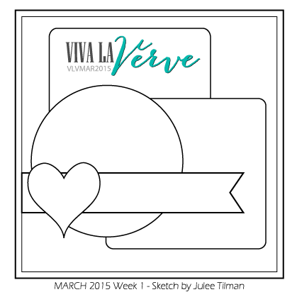
My card:


Pieces of patterned paper from Teresa Collins and KaiserCraft.
Verve stamp sets and coordinating dies used: Flowers - Joyful Blooms, Leaves - Lean on Me, Chevron - Borderline.
Sentiment banner dies also from Verve.
Some sequins and black plastic dots round it off.
Afrikaans sentiment saying: 'Congratulations'.
Thanks for popping in and hope to see you again soon!!!
Till next time!!!!

great cards, Petra! Love the colors, and the mixture of industrial and natural elements! hugs, de
ReplyDeleteThese are gorgeous Petra! I love the crackled background on the first card and the bold, graphic colors and shapes on the second!
ReplyDeleteNog 2 pragtige skeppings Petra!
ReplyDeleteDaai roos in die eerste kaartjie het my hart gesteel!
Mooi Sondag vir jou
x
Two lovely cards, Petra ... one soft and subtle, the other bold and vibrant ... gorgeous! Your second would fit Michele's Muse this week ... perfect colour fit! Anita :)
ReplyDeleteTwo more stunners Petra!! I don't know how you keep coming up with all these new ideas!! So imaginative! Gorgeous! Have a lovely Sunday! Hazel xx
ReplyDeleteI think this is the first color challenge I have seen you join in with [probably not, but I seem to only catch the sketches] Anyway -- awesome job - I do love the Verve Sketch card though. You really rock those out!
ReplyDeleteBeautiful cards Petra. Love the soft roses on the first one... did the guide help to layer the images? The crackle image looks perfect in the background! The chevron paper is so pretty with the yellow flower on the second card. Also like the little flower peeking out from underneath the paper. The die-cut circles look great.
ReplyDeleteYour rose image is beyond stunning! You have done an incredible job coloring it. The colors look almost 'velvet-ie'. Love the bit of crackle paper!
ReplyDeleteThe hues of the orange and green in your second card are so soft and pretty - a somewhat 'muted' effect - gorgeous! Great contrast with the variation in size of the top and bottom chevrons.
Two more knockouts dear friend!
gorgeous cards Petra! TFS!
ReplyDeleteSuch pretty cards Petra! The blossoms are beautiful! Love all the layered die cuts!
ReplyDeletebeautiful cards..thanks for joining Pals color challenge this week!
ReplyDeleteanother absolutely stunning set of cards, petra!! love the beautiful softness of the first card and the way you used the patterned papers on the second!
ReplyDeleteOh such a pretty card!! Just love it!! Thank you for playing along with The Pals!!
ReplyDeleteHi, Petra! LOVE the use of those soft colors on the first card--it is just SO pretty! Making me long for spring! ;) The second one is fabulous with that bold mustard! LOVE all your creations, as usual, friend! HUGS! :) Mynn xx
ReplyDeleteGave kaartjes leuke sketch ook ga ik ook eens kijken.
ReplyDeletePetra, every detail is simply beautiful! I love both cards.
ReplyDeleteEvery time I see ur cards... I end with WOW!
ReplyDeleteThese are just breathtaking! Love those open circle frames
ReplyDeleteBeautiful! Your rose is gorgeous and I love the bows! I keep trying to make little circles with my twine but can't quite get it to look cool and artsy like you do. Maybe I should try bows! Love the double rings on the second!
ReplyDelete